Tuesday, 9 June 2015

Presentation Feedback

I believe my group and I have made a great attempt to accomplish a project that should satisfy our clients' need. We as a group were all very happy with what we have produced and this was also evident through the rest of the classes' opinions and reactions based on our work. We've made a decent effort and I hope we can put smiles on our client's faces.

I think one of our huge pros were the fact that we went against the whole 'Slide Show' presentation idea and went for something more unique, aesthetical and presentable. After all, our client did request the project put on a website. 

We also decided to scrap the whole ''lets all present'' idea and perhaps leave it down to two people to present. We believed that this shows a neat and tidy presentation. Simple, easy to understand and there's not a whole bunch of us standing in each others way looking lost.

We did get a few errors on the website that Russell picked up on however we have gone back and edited. Video might have been too long.... we didn't get the chance to show the whole thing due to time, but perhaps the whole 9 minutes is essential to our client's website.

Final Presentations

Wheel

I'm not too sure that the group achieved what was asked of them, or that at least is my view on it. I saw a lot of hard work put into the project but the end result wasn't what I expected. They got the truck all modelled up pretty good. The wheel? well it could have been a lot more prettier from my point of view. Some paint wouldn't hurt. They got the wheel working though. Well done for that part but they presented the wheel using a 'car' in Unreal Engine. What was the point of modelling the truck? Presentation wise, they were all over the place. At times they gave me the impression they didn't know who was talking when or who's going next. They were standing in each others way.

[5/10]


Marker

I was expecting these guys to top the rankings to be honest. But what really let them down was..... they went AGAINST THE BRIEF! My group and I were having a debate on whether or not our group should 'Fail' them just for not meeting the clients' expectations! I insisted we didn't fail them because I recognised the 'hard work' the group had put in. The designs were great. Very thoughtful. A lot of concepts and ideas were presented and I thought they actually did try really hard. Their video was a little dull. They had the light rushing through the marker going one way but couldn't get it going back. Presentation was a lot tidier. I felt everyone knew what they were doing.
 
[5/10]


Oculus

Overall the group presented very well. They immediately told us the significance of the project and what they were trying to achieve. The whole class was with them from start to finish. I was a little gutted through not getting a chance to use the Oculus glasses although thankfully the group showed the rest of the class for those who didn't get a shot the opportunity to see what they were missing out on. Everyone did their job and I felt like as a group they ran smoothly all semester.
 
[8/10]

Museum
 
Museum was interesting. Enjoyed the whole 'Tablet/Ipad' experience! The presentation was really well done from my point of view. The whole group explained their part perfectly. The downside was.... yes it's a museum so where are the artefacts? What was presented to me could have been a school. I'm not too sure what programs they were using but I would have preferred something with a lot more quality in terms of graphics. I also picked up on something a group member pointed out during the presentation which was; they were told to ''change plan'' during week 7 of the semester which was well into the project. Perhaps this was time wasted?

[6/10]


Wednesday, 3 June 2015

My Experience


New & Old

2015
2014


Our client specifically made clear that they wanted us to edit
on last year's efforts. One of these were the gradients path of
the Ropeway. As we see above, the 2014 image shows the
ropeway on a more flat and smooth terrain where as the
client wanted us to try and replicate the Jamison Valley
steepness.

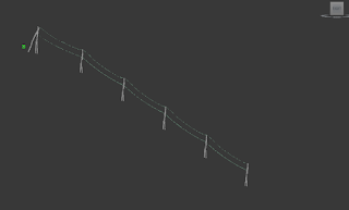
Another area of improvement were the cables. Philip Hammon
made it clear that last years project lacked the realistic look of
cables on an aerial ropeway. I therefore made sure the
cables 'sacked' or 'bent' the cables along the way
when modelling in 3Ds Max.


Thursday, 21 May 2015

Modelling Unloading Station


Re-doing Towers and Cables


When exporting into Unreal Engine 4, I came across issues with scaling. According to my group members, the towers looked too small. I then placed a human built in UE4 next to the towers and gave it a sense of scale. It looked correct.


Tuesday, 19 May 2015

Connecting Towers & Modelling Cables


I originally wanted to Export from MAX to UE4 and place the towers at each one's location. I then figured this would be harder as it makes it almost impossible to add the cables. So I went back and added the cables and exported the models as one.